Bluescape Design System
Overview
Bluescape’s cloud-based visual collaboration platform empowers users to collaborate remotely via a visually immersive environment.
Role
Product Designer — 2020-2021
I led the development of Bluescape’s design system.
I determined its fundamental principles by extending
the brand identity and delineating critical UI elements
for the launch of a new UI.
Objective
Research
I started with extensive research. I analyzed industry trends and examined Bluescape’s and other brands’ design guidelines. I also considered the specific needs and challenges of Bluescape’s users, regarding accessibility and usability, to ensure our design system met those needs. This research informed my decisions regarding our color palette, typography, iconography, and grid system, and continued to guide us as we added new components and patterns.
UI Inventory
I conducted a UI inventory that covered web, mobile, and large touch screen editions of the product, in order to identify common design elements that could be reused across various components and pages.
UI Inventory: web, mobile, and large touch screen display
Design Language
While creating the Bluescape design language, I collaborated closely with stakeholders from various teams to secure approval prior to constructing the design system.
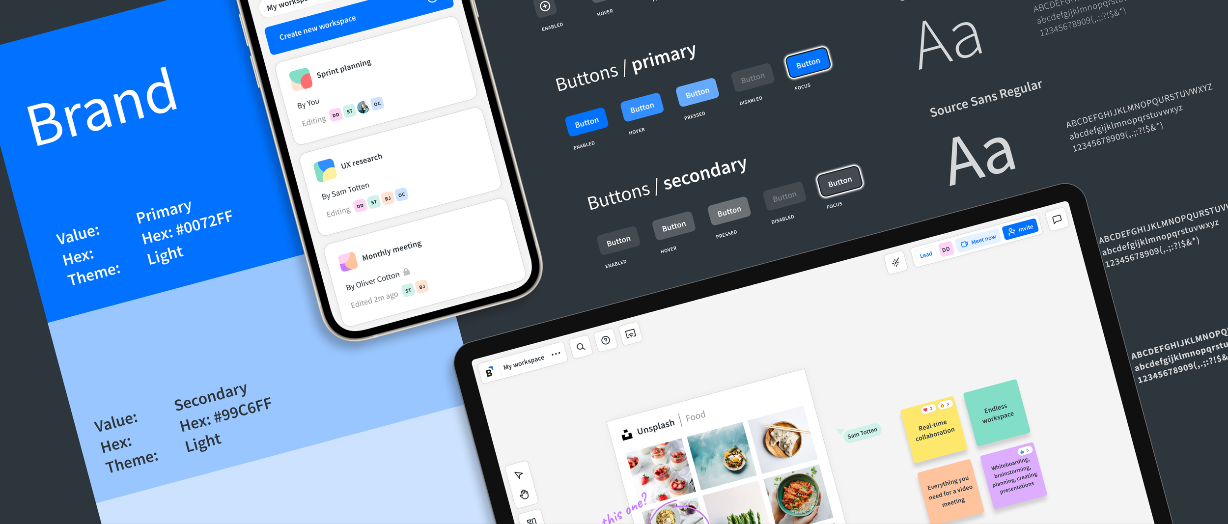
Color Palette
While examining Bluescape’s brand colors, I identified the need to extend and adapt the color palette to meet accessibility contrast requirements and create components for both light and dark themes.
Color palette: before and after
The refreshed color palette incorporates softer hues to enhance visual comfort and promote a more user-friendly experience.
Typography
During my UI inventory, I discovered that various fonts were being used in the UI, leading to a lack of consistency and coherence in the design.
To address this issue, I selected a single primary typeface for the product while still preserving the brand’s personality by choosing a primary typeface from the brand’s guidelines. This decision improved consistency and helped reduce visual clutter in the UI design.
Typography: Source Sans Pro font
While developing a typographic scale, I created a system with thirteen distinct styles that cater to the requirements of the product and its content. This system guarantees visual hierarchy and a harmonious typography experience.
Typographic scale
Iconography
Icons are indispensable components in visual collaboration applications as they foster communication and facilitate interaction. They should be clear, legible, and unobtrusive, so users find them intuitive. My UI audit exposed inconsistent icon styles and sizes across the interface.
Iconography: before and after
To promote simplicity and comprehension, I chose an outlined icon style, which helped declutter the interface and improved usability.
Toolbar icons: before and after
Responsive by Design
We prioritized responsive web design as a key component of the product development strategy. This ensured that our users would have a consistent and cohesive experience, regardless of the device they chose to use to access Bluescape.
UI Elements
For the UI elements, I prioritized usability and accessibility for the specific needs of Bluescape users. To keep the experience intuitive and consistent across all touchpoints, I adhered to the brand identity and values. I also worked closely with the product and engineering teams to integrate the design language into the product.
UI elements: light and dark themes
In less than one month, I developed a striking high-contrast theme that adhered to stringent color contrast accessibility standards.
UI Elements: high-contrast theme
Guidelines
I created a set of guidelines for implementing the design components, including icons, colors, and UI elements.
Icon guidelines
Button label guidelines
Accessibility
Accessibility was of utmost importance, driving us to prioritize building accessible components that met customer requirements.
This effort included creating detailed guidelines describing accessible component behaviors that provided clear instructions on how to implement accessible components that adhered to WCAG guidelines.
Accessibility: keyboard focus and dialog behavior guidelines
Results
In less than 6 months we built our first Design System in Sketch.
Subsequently, we migrated to Figma to build a more comprehensive and scalable version.
Outcome
Visual harmony and attention to detail yielded a consistent design language across touchpoints. This constituted the foundation of a flexible and scalable design system, built to evolve with future design needs.